Trip App
Date Completed
March 2020
Type
UX Design | UX Research
Timeline
1.5 Months
Role
UX Researcher, UX Designer, UI Designer
Discovering the Problem
The Problem Space
International tourism has increased from 70 million in the 1960’s to 1.4 billion in 2018, and it is still on the rise! A large contributor to this increase are Millenials. Research shows that they are the most willing to go into debt in exchange for
the experience of travel. However, as much as they love travel, many admit that planning these experiences can be daunting, tedious, and even stressful.
- 3 months prior to vacation, travellers start searching for travel experiences 3x more than hotels and 8x more than flights.
- Even considering the fact that the initial search typically begins 4 months in advance, travellers are still continuing their search while on vacation.
These findings prompted me to delve further into the issue of leisure travel planning with hopes to identify opportunities for improvement in the process.
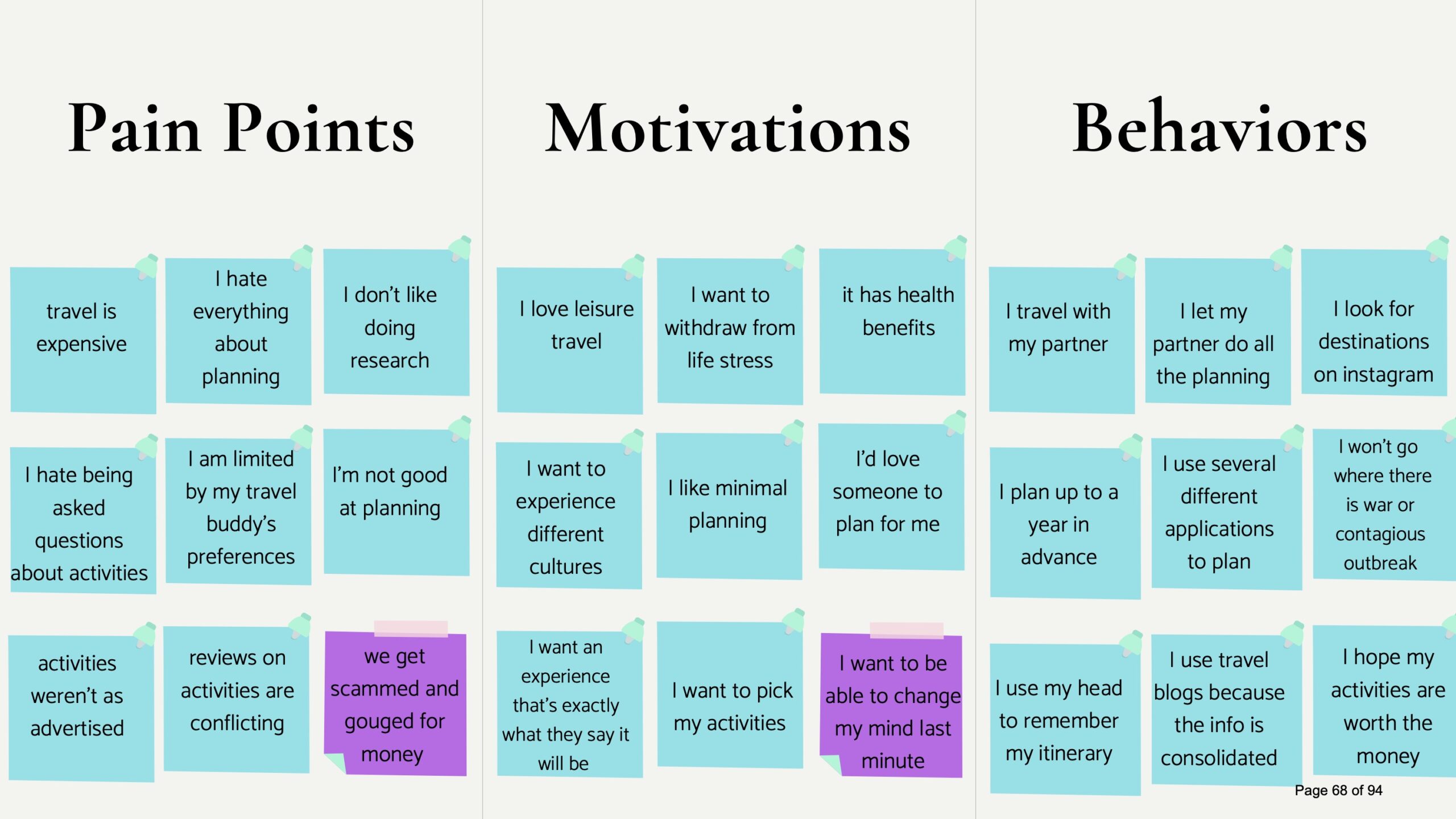
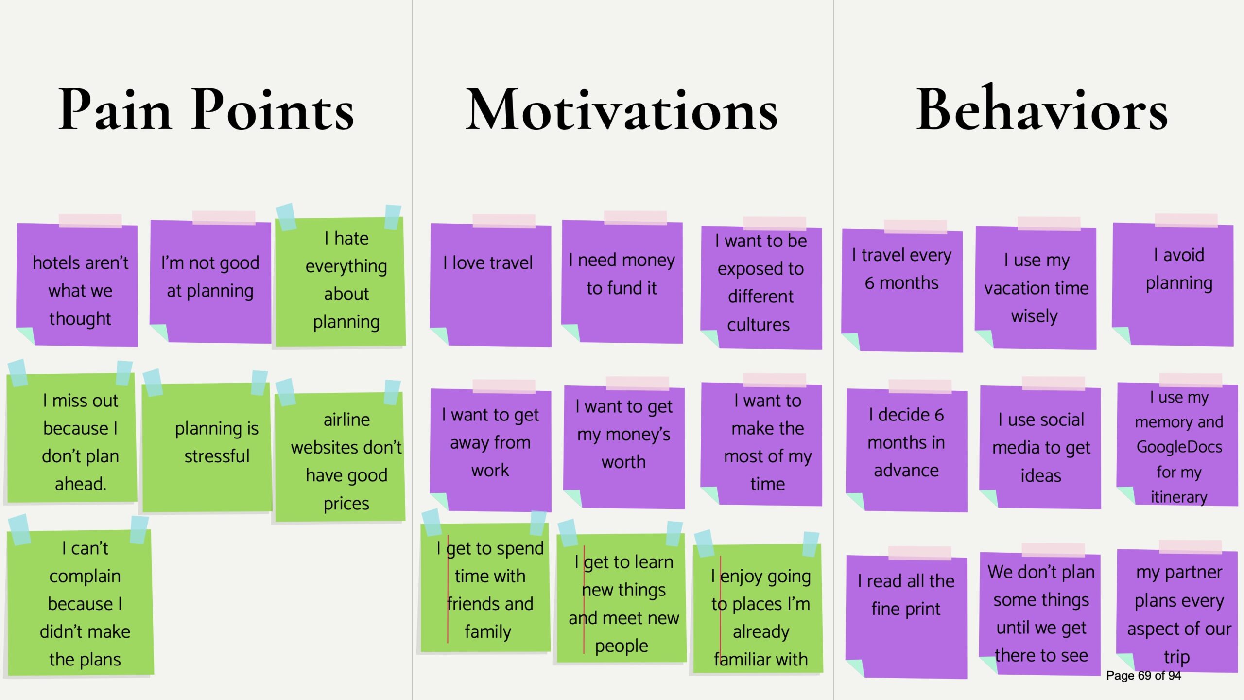
Primary Research Findings
For my primary research, I decided to conduct face-to-face interviews and send out an online survey. This helped me collect both qualitative and quantitative insights about my target users’ pain points, motivations, and behaviours.
In-Depth User Interviews
I chose to to do in-depth interviews that were semi-structured. This allowed me to go off script when needed in order to gather more insights about any new areas of interest that came up. There were 4 key insights gathered from the interviews:
Research
Participants expressed that they often felt overwhelmed by information.
Planning
Participants admitted that they purposely avoid planning and often pass the responsibility off to someone else.
Accuracy
Participants felt that experiences weren’t always as advertised or that reviews were conflicting and cause confusion.
Social Influence
Participants made decisions based on a friend’s or influencer’s social media content.
Surveys
After collecting data from 30 participants, I discovered:
- 53% found looking at travel inspiration to be the most enjoyable part of planning.
- Participants used up to 10 different apps in order to plan their travel.
- 47% found researching and booking to be the most time consuming and 70% would rather have it done for them.
"How might we relieve the stresses associated with leisure travel planning for young adults?"
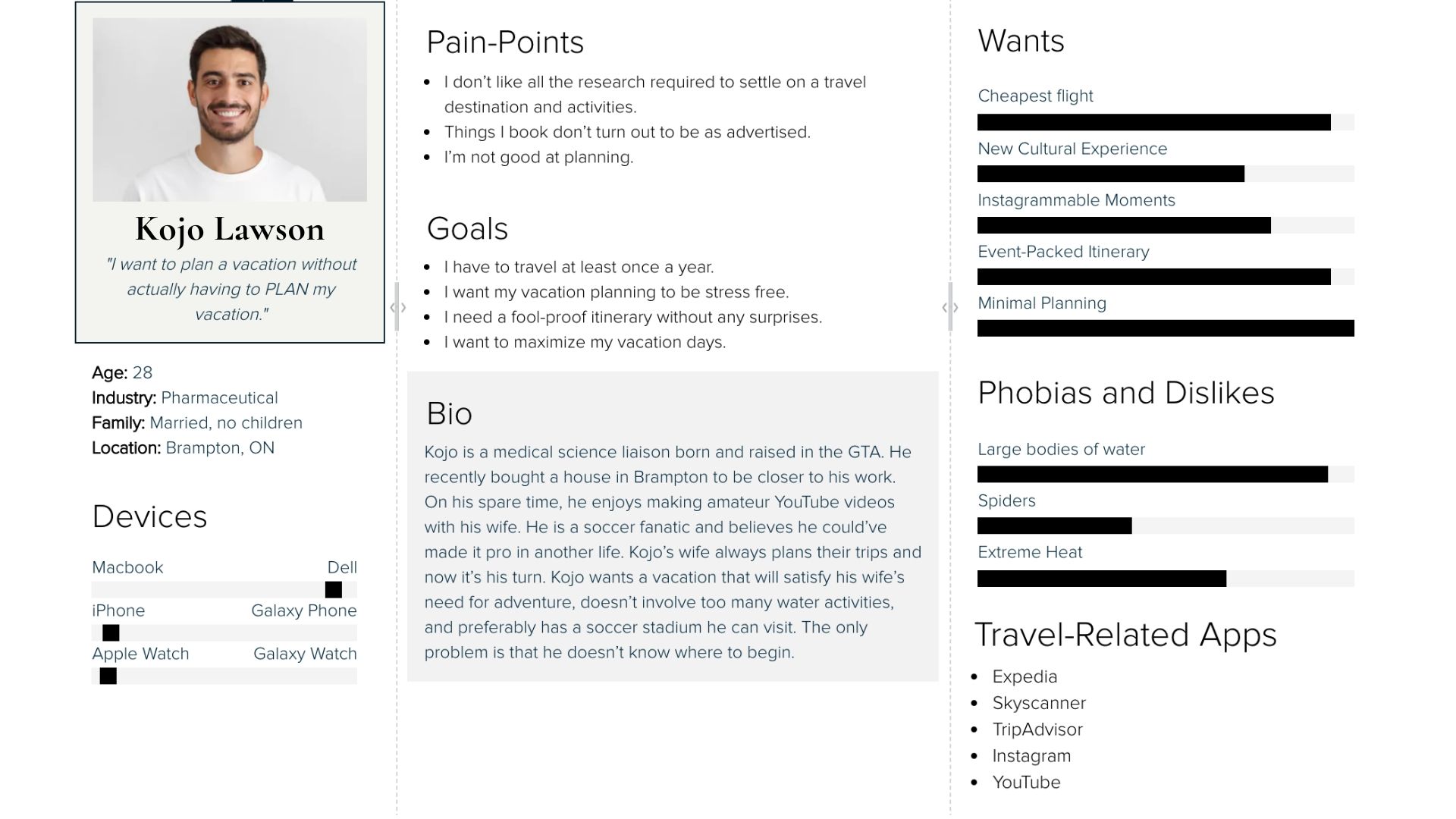
The User Persona
Identifying The Moment of Opportunity
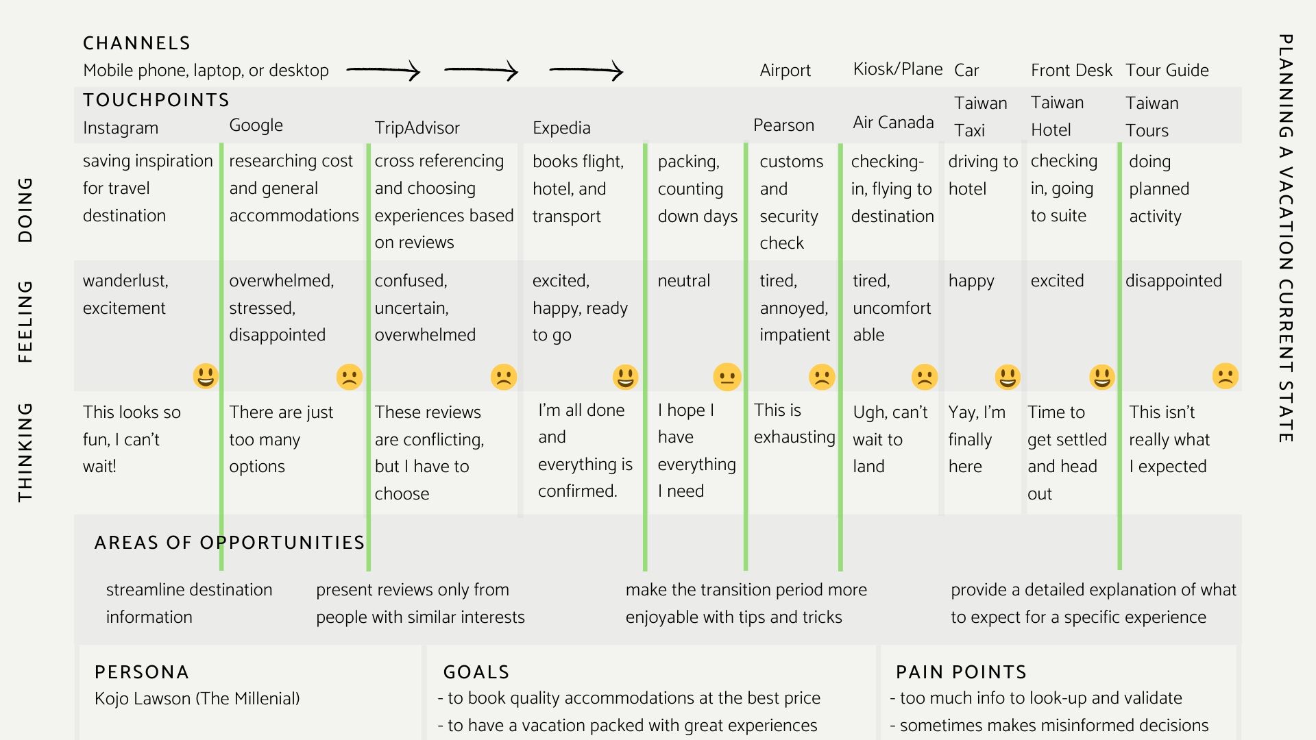
Early Research + Selection
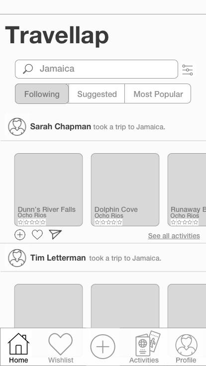
Using an experience map, I was able to identify multiple areas of opportunity and decided to focus on the early research and selection phase of travel planning. The aim was to reduce feelings of stress, confusion, and frustration at the moment where travellers are browsing the web for options and selecting based on the reviews of others.
The Proposed Solution
A More Social Approach to Travel Planning
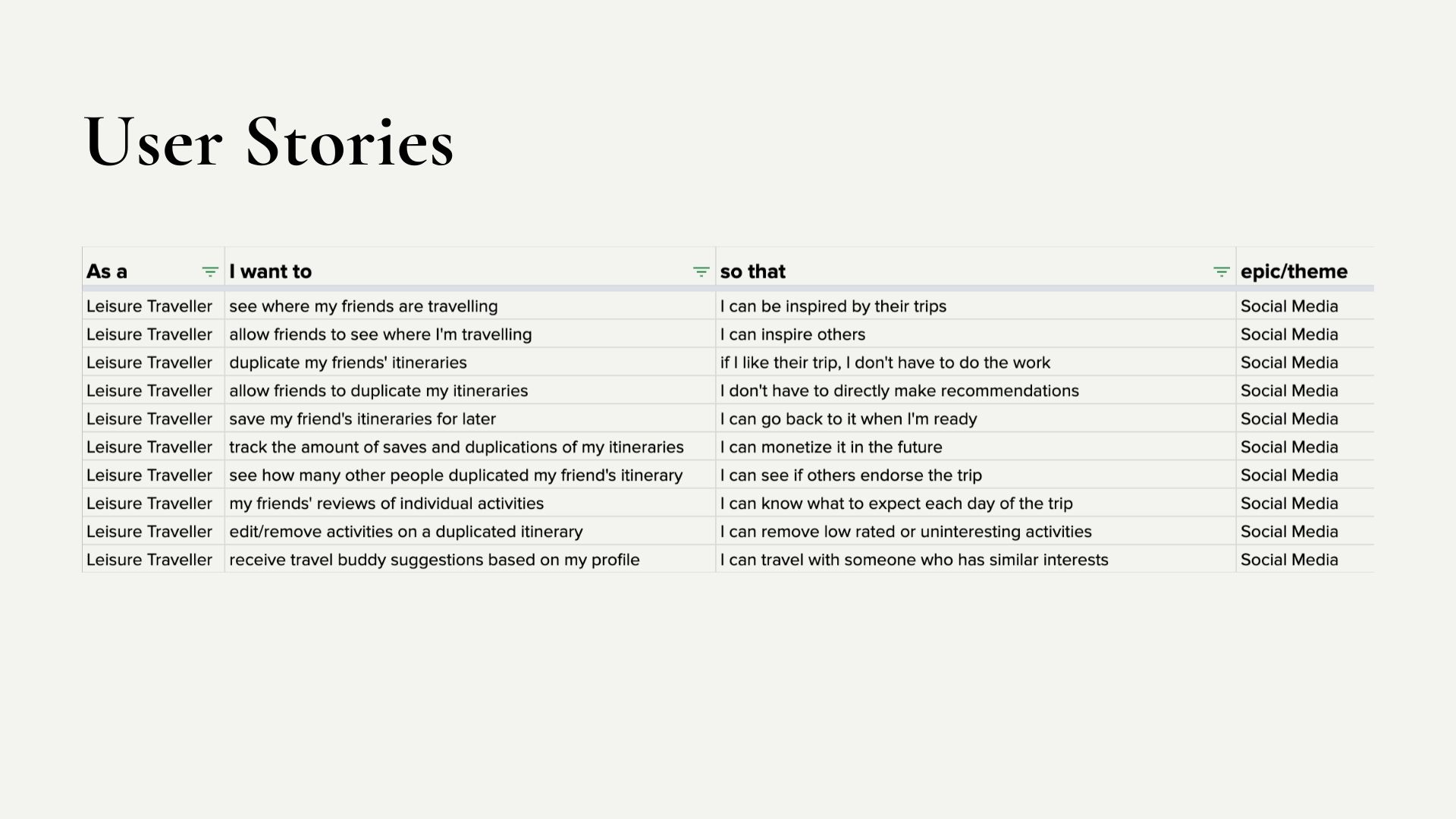
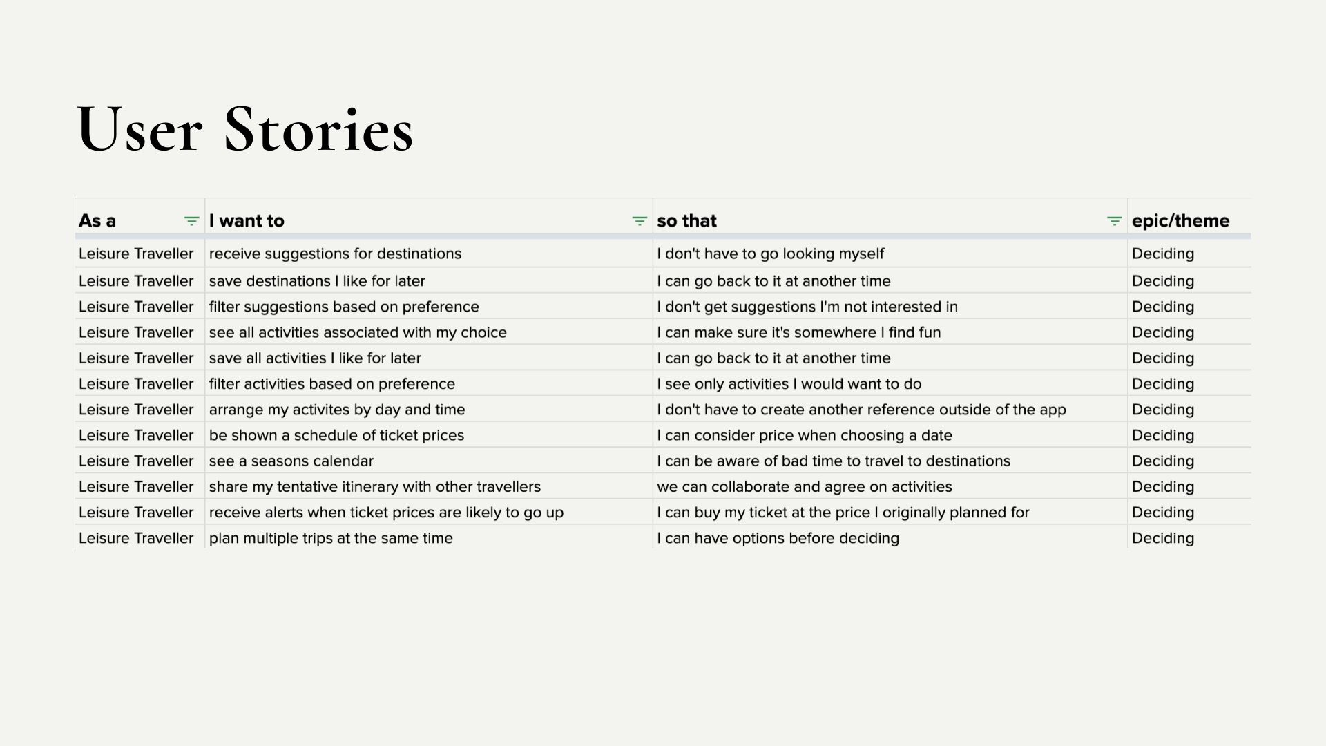
For the purpose of my prototype, I decided to focus on the epic ‘Social Media’. This epic included user stories that heighten the social aspect of travel planning.
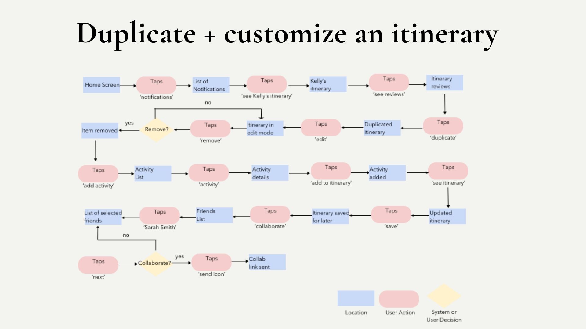
Task Flow
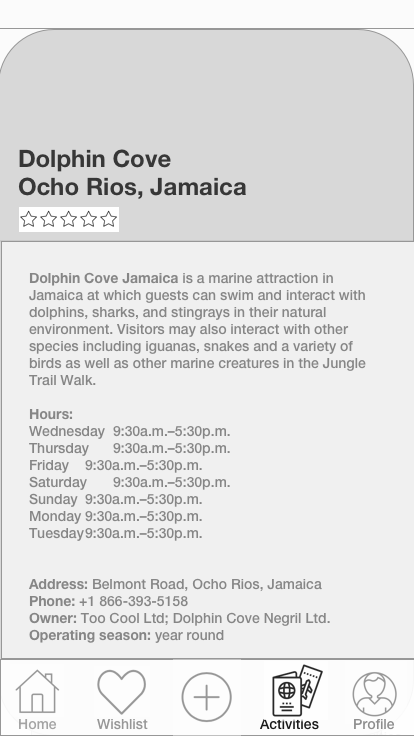
The main task flow I chose was to duplicate and customize an activity list. Upon completion, the sub task was to send a collaboration link to friends.
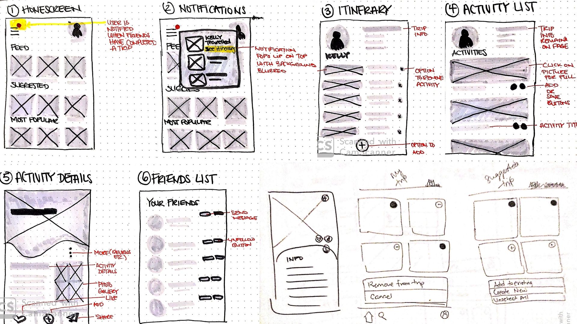
Sketches
After deciding on which epic I would focus on, I drew sketches to map out the applications features in several different ways.
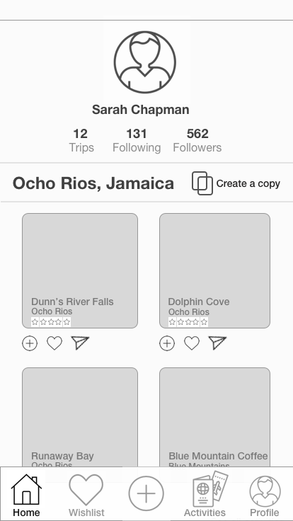
Creating Wireframes
Once I chose the final sketches, I created the first set of wireframes. The goal was to create a mid-fidelity prototype that was robust enough for a usabilty test. My goal was to ensure that this product was not only easy to use, but that it would actually address the main pain points expressed in earlier interveiws. Based on the feedback I received, I made quite a few changes to product features and tested once more before adding any colour to my design.
User Test Findings
There were a number of usability issues highlighted by users who tested my prototype. Majority of this issues fell under one of the following themes:
Consistency & Standards
Tapping a button on one page would provide a different outcome if tapped again on another page. These buttons were changed to make their different functions clear to the user.
Flexibility & Efficiency of Use
The images were made bigger to improve visibility. Also, the task flow to create a customized activity list felt long for users. To address this, some steps were removed to reduce friction and create a faster and more efficient flow.
Affordance
Tapping on certain buttons changed the state of the page without the user’s knowledge. Visual cues were added to show the user that they activated a new page state (i.e. edit mode vs. locked mode).
The Final Iteration
A New Task Flow
I created a new task flow based on the feedback received during user testing. The main task was changed to create an activity list inspired by a friend’s trip.
Branding
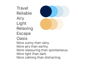
When the time came to inject colour into my designs. I created list of buzz words that best described the emotions I wanted the brand colours to evoke. My aim was to create a palette that made users feel happy, relaxed, and reassured. I searched for inspiration on different platforms and compiled a mood board which guided my decisions during colour selection, logo/icon design, and UI Library building.
Considering Accessibility
Accessibility was considered at every stage. For example, when the prototype was in grayscale, I made considerations for image descriptions. When it came to injecting colour, accessibility played a a large role in my choice of brand colours and how I used them. It was important to me that my design was inclusive and passed WCAG 2.0 AAA contrast standards.


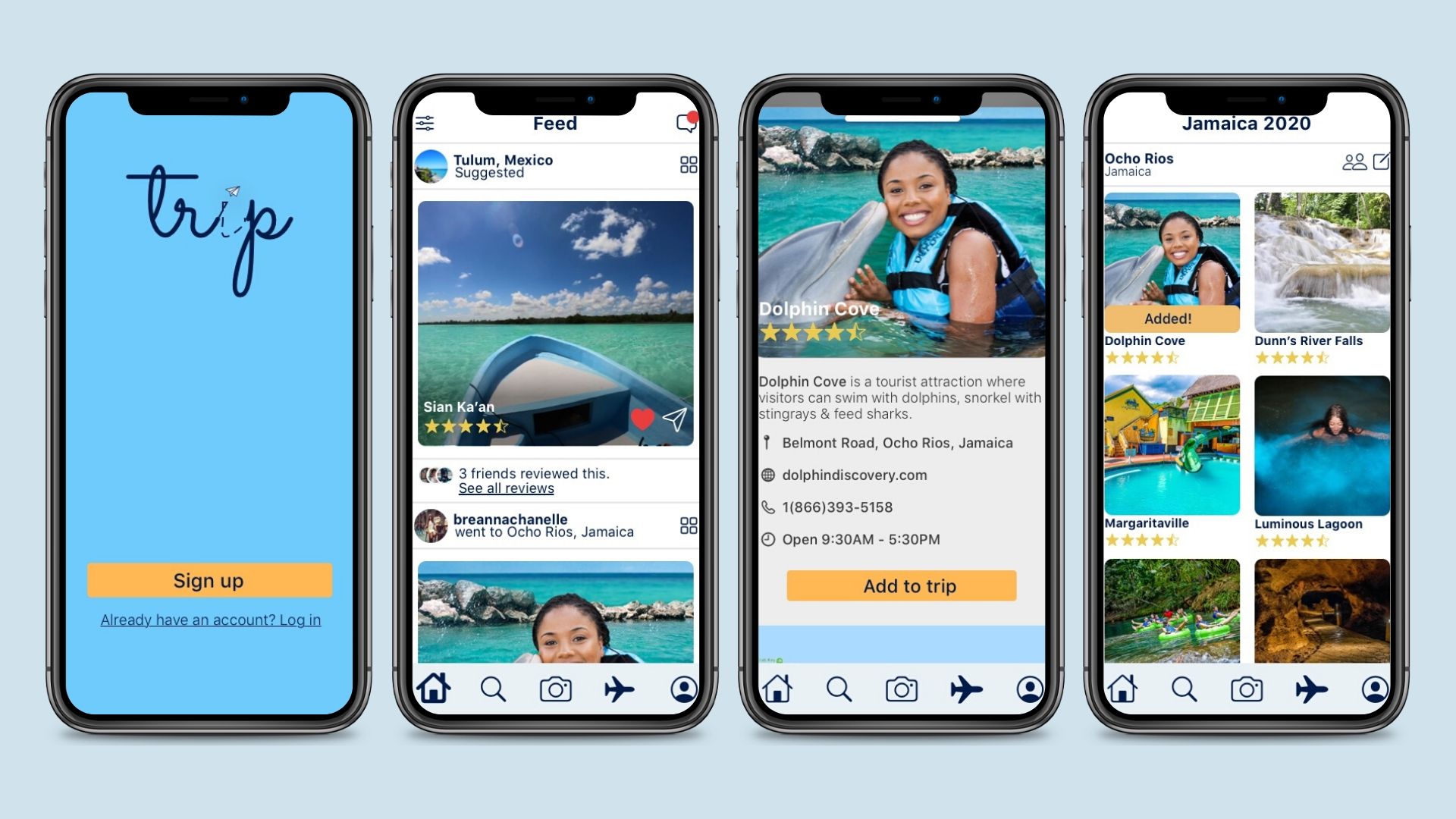
The Final Prototype
You can check out the full interactive prototype in Invision.
Exploring Other Platforms
Apple Watch
The Apple Watch would be a great secondary platform to support future features such as calendar reminders or event tickets and passes. The watch allows travellers to stay informed even during activities where mobile phones must be left behind.


Design Impact
Simplified Planning
This design would reduce the amount of applications travellers currently use to plan their vacations. It would also change the way people consider relevant reviews in comparison to ambiguous star ratings. The display of reviews from like-minded individuals will benefit the traveller by providing only relevant information, but it will also benefit businesses by providing a buffer for biased reviews.
Future Considerations

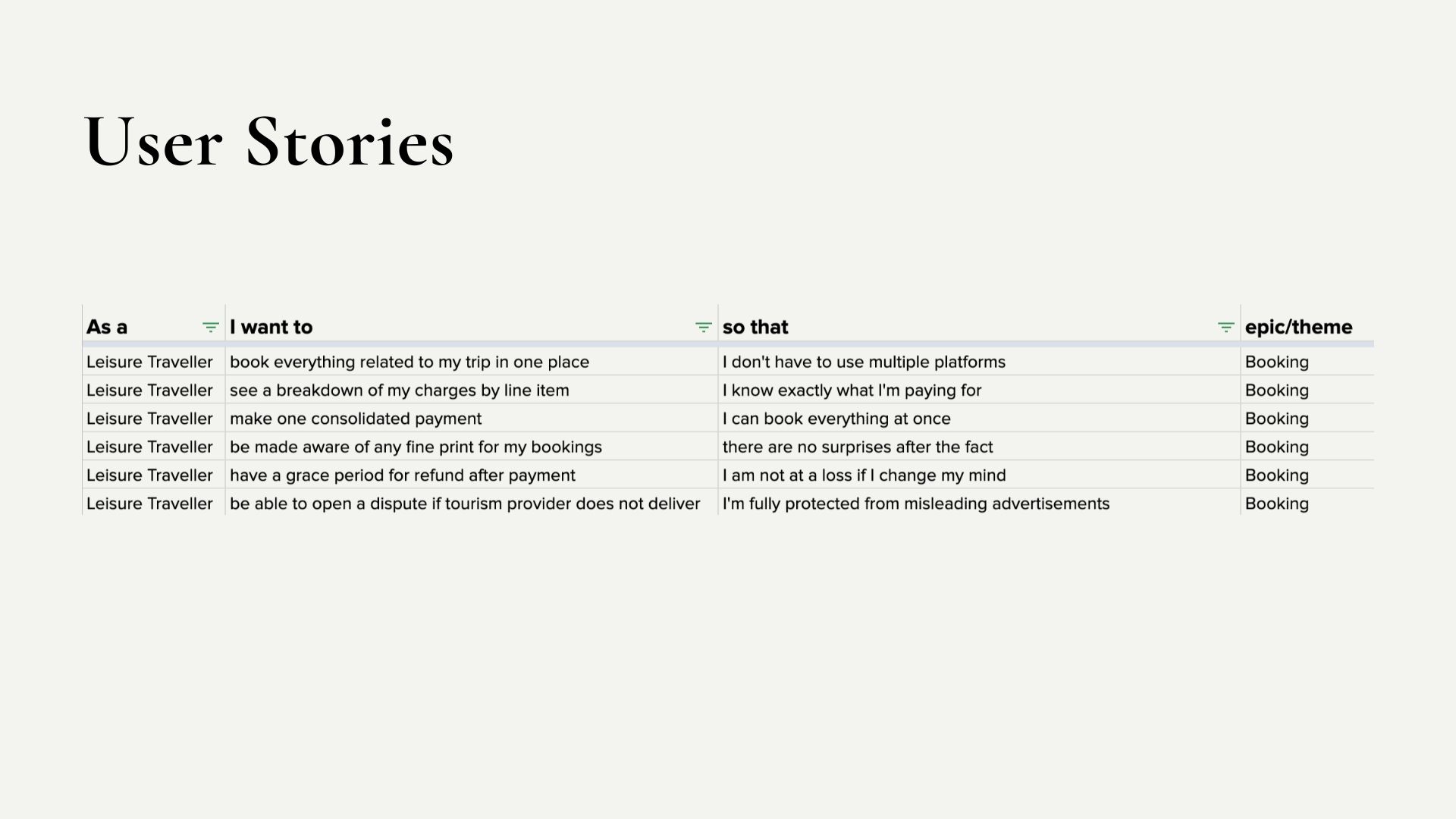
Consolidated Payment
Allowing travellers to book and pay for all selected activities in one consolidated payment rather than booking each activity individually.

Flight Booking
Integrate flight booking with push notifications to inform travellers when flights prices have gone down or are about to go up.

Full Itinerary
A full calendar that helps travellers keep track of every planned event from packing all the way through to their return flight.

Haptics & Gestures
Use haptics and advanced gestures to provide travellers with a more immersive experience.
Selected Works